In today's competitive marketplace, the design and user experience of a B2B website is critical. An engaging B2B website can attract more potential customers and boost performance. In this web design guide, we'll share seven practical tips to help you craft a website that stands out and double your revenue next quarter!
What is B2B Web Design?
B2B web design is tailored to meet business-to-business needs, focusing on converting visitors into customers and turning them into sales. Unlike personal websites, B2B sites prioritise lead conversion through structured layouts and strategic content.
Here are 7 tips for designing a website that drives leads and conversions:
- Clear and Concise Design
- Responsive Web Design
- Strong Calls to Action (CTA)
- Search Engine Optimisation (SEO)
- High-Quality Images and Video Content
- Social Media Integration
- Good UI and UX Design
How to Design a Website: 7 Practical Tips
1. Clear and Concise Design
Compared to complex designs, a clear and concise web design lets customers quickly understand your business, products, and services. Choosing high-contrast and easy-to-read fonts, as well as colours that highlight vital information, can enhance the quality of your design. Meanwhile, maintaining a neat and orderly web page layout helps users find the content they need more quickly.
Proper spacing and distance between elements can also make your website appear more comfortable to the eye. A good web design should be user-centric, helping users quickly find the content they need, thereby improving their overall satisfaction.
Website design ideas: Orbital Sidekick
(Source: Orbital Sidekick)
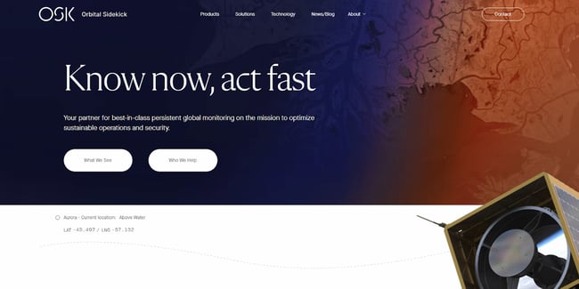
Orbital Sidekick (OSK) is a company specialising in space sensing services, aiming to provide real-time, global monitoring solutions for clients using advanced spectral imaging technology. In its website design, OSK employs a clear and concise style to communicate the company's core values and product features effectively. The webpage design uses plenty of space to achieve a precise and easy-to-read effect. Through well-designed navigation bars and buttons, users can quickly understand their service, technical advantages, and how to contact the OSK team.
2. Responsive Web Design
Responsive web design (RWD) allows your website to automatically adjust its graphical content according to the screen size on different devices, providing an optimised user experience. RWD is essential because if your potential customers are browsing the internet on their phones and your website does not adjust its content to fit the device, they will likely close the website, resulting in a high bounce rate.
Therefore, when choosing web design software, you must select tools that support responsive web design. HubSpot CMS supports RWD, allowing you to build websites that can adapt to various devices quickly. Using HubSpot, you can ensure that your website looks good on any device, which is critical to attracting more potential customers.
Website design ideas: Urban Umbrella
 (Source: Urban Umbrella)
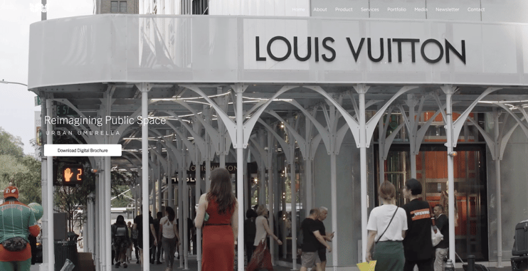
Urban Umbrella (UU) is an innovative scaffolding company that provides environmentally friendly, safe, and aesthetically pleasing temporary scaffolding solutions for construction and renovation projects. Urban Umbrella (UU) uses responsive web design on its website, allowing the layout, images, and content to adjust automatically to fit different screen sizes. For example, on desktop computers and laptops, UU's website navigation bar is typically displayed horizontally at the top, whereas on mobile phones and tablets, the navigation bar folds into a hamburger menu to save screen space; content also adjusts to a single-column display for easier browsing and to help users find the information they need.
3. Strong and Effective Calls to Action (CTAs)
Calls to action (CTAs) are one of the most essential parts of website design. A CTA is an action that designers want users to take after browsing the website, including subscribing to newsletters, downloading materials, purchasing products, or contacting the team. In B2B website design, this step is significant.
Effective CTAs should have bright colours, easy-to-read fonts, and prominent button shapes to attract users' attention on the website quickly. The placement of CTAs is also critical, such as positioning them at the top of the homepage, at the bottom of articles, on product or service pages. You can also place additional CTAs in the website's sidebar or pop-up window to increase conversion rates.
Website Design Ideas: InEvent
(Source: InEvent)
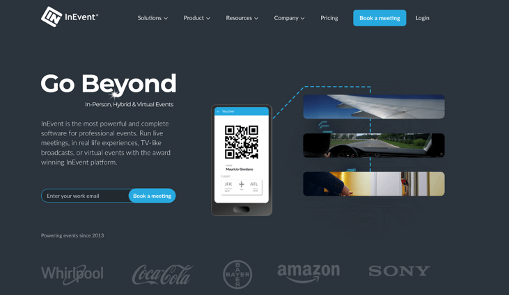
InEvent is a company that provides a one-stop event management platform for businesses, helping companies plan, execute, and monitor events of various sizes more easily. On InEvent's webpage, they use strong CTAs to attract and guide users to take action. At the top of the homepage is a prominently placed "Book a Meeting" button, allowing potential clients to contact the team directly.
Additionally, in various sections of the website, such as product descriptions and the resource centre, there are CTA buttons like "Learn More," which allow users to take immediate action after receiving the relevant information. These targeted CTA settings help to improve user engagement and conversion rates, thereby bringing more clients and business opportunities to the company.
4. Search Engine Optimisation (SEO)
Search Engine Optimisation (SEO) plays a crucial role in improving the ranking of a company's website and attracting potential customers. During the web design process, it's vital for your website to achieve high exposure and ranking on search engines:
To achieve ideal SEO results, you need to pay attention to several things:
- Choose appropriate keywords.
- Create high-quality content.
- Ensure fast page loading speed.
- Use understandable URL structures.
- Add suitable title tags and meta descriptions.
Moreover, properly managing internal and external links on your website can help search engines better understand your website content, thereby improving your ranking.
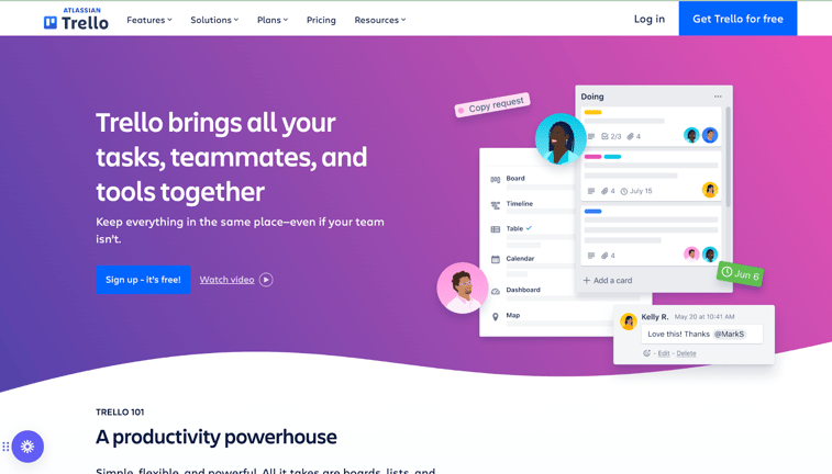
Website Design Ideas: Trello
(Source:Trello)
Trello is a well-known project management and collaboration tool. The homepage is optimised with the keywords that users might search for, such as Productivity and Workflows. In addition, the website's internal linking strategy is clear and concise, which is beneficial for search engine crawling and indexing, allowing users to conveniently navigate the site and quickly find the information they are interested in.
5. High-Quality Images and Video Content
In B2B web design, high-quality images and video content are especially important. Excellent visual elements can attract users' attention, increase users' dwell time on the site, and enhance brand image. Therefore, you must choose professional images and videos that align with your brand image, and avoid using low-resolution or off-topic materials.
In addition to selecting the appropriate images and videos, you must consider their layout and presentation on the web page. A reasonable arrangement of pictures and videos can make the website look tidier and more efficient, enhancing the user experience.
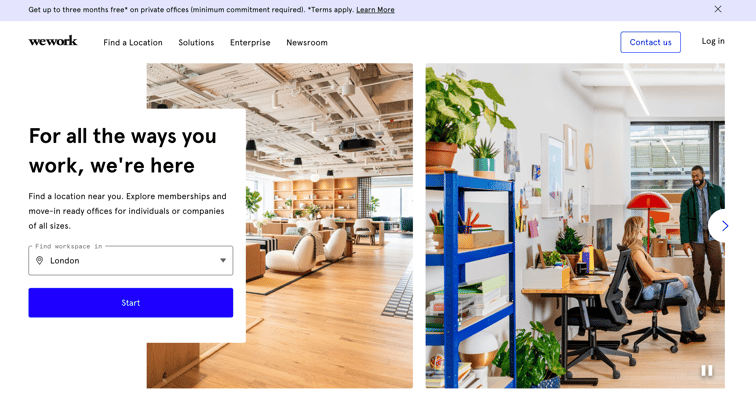
Website Design Ideas: WeWork
 (Source: WeWork)
WeWork is a globally renowned shared workspace provider offering flexible office solutions for businesses and individuals. On WeWork's official website, the homepage displays a striking real-life photograph showcasing modern shared workspaces and people interacting. This high-quality photograph makes the website look more professional, authentic, and appealing.
This photograph highlights the WeWork brand image and leaves a strong visual impression. WeWork's website also skilfully incorporates video content, allowing users to learn about the workspaces and services they offer through videos. High-quality images and video content play a crucial role in WeWork's website design, successfully attracting and retaining potential customers.
6. Social Media Integration
Integrating social media into website design can facilitate users to follow and interact on different platforms and increase the company's exposure and reputation online.
To achieve effective social media integration, you can place your social media handles in prominent positions on your website, such as at the top, bottom, or sidebar. Moreover, you can allow users to easily share website content to their social networks through social media share buttons, thereby expanding the website's influence.
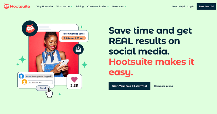
Website design ideas: HootSuite
(Source: HootSuite)
Hootsuite is a well-known social media management platform that helps businesses to manage and optimise their social media strategies more effectively. As a company focusing on social media, Hootsuite's official website naturally showcases the importance of social media integration.
On Hootsuite's official website, social media buttons are located at the bottom of the page, including icons for multiple platforms such as Facebook, Twitter, LinkedIn, and Instagram. This arrangement allows users to follow and interact on different social media easily.
Additionally, Hootsuite's blog posts and resource centre also provide social media sharing features, enabling users to share valuable content to their social networks, thereby further increasing Hootsuite's online exposure. This excellent social media integration strategy has helped Hootsuite attract more potential customers and strengthened connections with existing customers.
7. Good UI and UX Design
User navigation and information architecture are important considerations in B2B website design. A good website structure allows users to find the information they need on the site easily, improves the user experience, and reduces bounce rates. Therefore, you need to build a clear, concise navigation menu, organise website content reasonably, and ensure that users can quickly browse the sections they are interested in. In short, you must provide the website's User Interface (UI) and User Experience (UX).
When designing website navigation, maintaining consistency and usability is crucial. You should choose easily identifiable and operable navigation elements so that users can use the website easily on different devices, which is the responsive web design mentioned earlier.
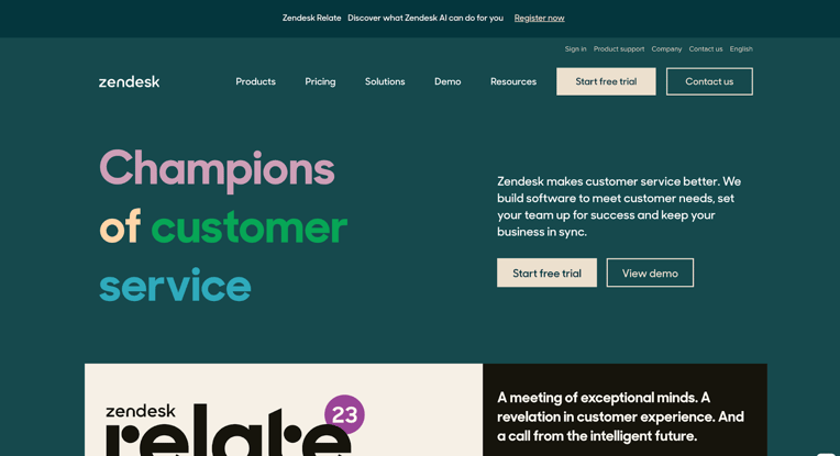
Website design ideas: Zendesk
(資料來源:Zendesk)
Zendesk is a SaaS (Software as a Service) company that provides business customer support and relationship management. On Zendesk's official website, they emphasise user navigation and information architecture. At the top of the website, users can easily find the features and pages they need. The homepage has main functions such as registration and login buttons, and it's easy to see various products and solutions. In addition, they have set up important pages at the bottom of the website, such as About Us, Careers, and Contact Us.
Zendesk has also cleverly embedded social media icons at the bottom of the website, allowing users to easily follow their social media accounts, thereby enhancing brand loyalty and reputation.
Start Improving Your Web Design to Drive Leads and Conversions
The key to creating a good web page is to always consider the user's browsing experience. Whether it's responsive design, image and content design, CTA setup, or user navigation, the design's intention must be to make it easy for users to find the information they need and to establish interest and trust in the product or service.
Want Further Professional Guidance?
If you want one-on-one professional guidance, the Oxygen team is more than happy to assist you with professional website design, tailoring suitable website design solutions for your business, and ensuring your website design to successfully implement. Feel free to contact us today!
Want to stand out in the online world with HubSpot CMS?
Click on the image below, or contact a web design expert to learn about the solution that suits you!
 UAE/GCC
 International


